Redesigning Notion's first-time user experience
Reducing cognitive overwhelm, defining a clear beginner path, and helping new users reach their first win in under 3 minutes.
The promise and the paradox of Notion
Notion is one of the most ambitious productivity tools ever built. Its infinite canvas model - equal parts note-taking app, database, project manager, and wiki - has earned it a cult following among power users worldwide. With over 35 million users, Notion isn't just a product - it's a philosophy about how knowledge work should feel.
And yet, there's a stubborn contradiction at the heart of Notion's growth story: the very flexibility that makes it brilliant for advanced users makes it deeply intimidating for beginners.
Notion's typical user journey for a first-time user
💬 In user interviews, first-time Notion users consistently describe their first session as: "I opened it, stared at the blank page, and had no idea what to do." That moment - that pause before forward momentum - is where activation dies, and where this project began.
Where does the confusion actually start?
Before forming any hypothesis, I spent the first week simply observing. I watched screen recordings of first-time users opening Notion, read every 1-star App Store review from the past two years, and combed through Reddit threads where beginners vented their frustration.
What emerged wasn't a single "broken flow" - it was a cascade of small confusions that compound into a feeling of being completely lost.
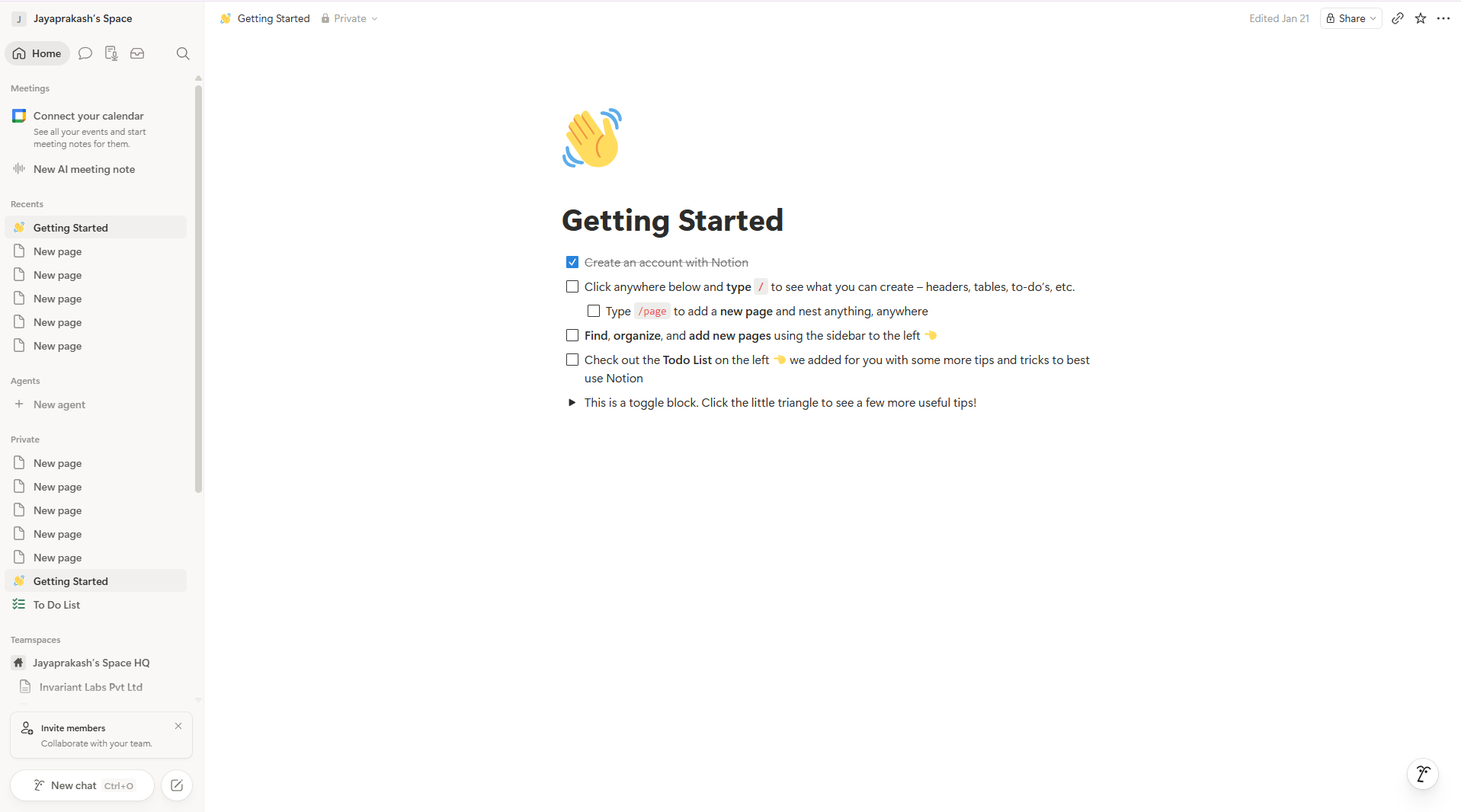
Why first-time users drop off - a cascade of small confusions
🎯 How might we redesign Notion's onboarding to help first-time users understand the product quickly and take their first meaningful action within 3 minutes?
Blank canvas shock
Users land on an empty workspace with no direction, no welcome, and no orientation. There's no obvious "start here" moment.
Template paralysis
The template gallery has 100+ options with names like "GTD System" and "Life OS" - unfamiliar jargon that confuses more than it helps.
Feature overload with no context
"Blocks", "databases", "views" - these terms mean nothing to someone opening Notion for the first time. The sidebar exposes everything at once.
No first-win moment
Even if a user sets something up, there's no sense of completion or validation. No celebration, no next step, no reason to come back.
Evaluating the current experience
Before testing with users, I walked through the existing onboarding flow myself and noted every point of confusion using Nielsen's 10 heuristics as a lens.
Screen 1 - Sign up & Welcome
After signing up, users are asked their role - but this info doesn't seem to personalise anything. Users feel like they filled in a form for nothing.
Screen 3 - Template Gallery
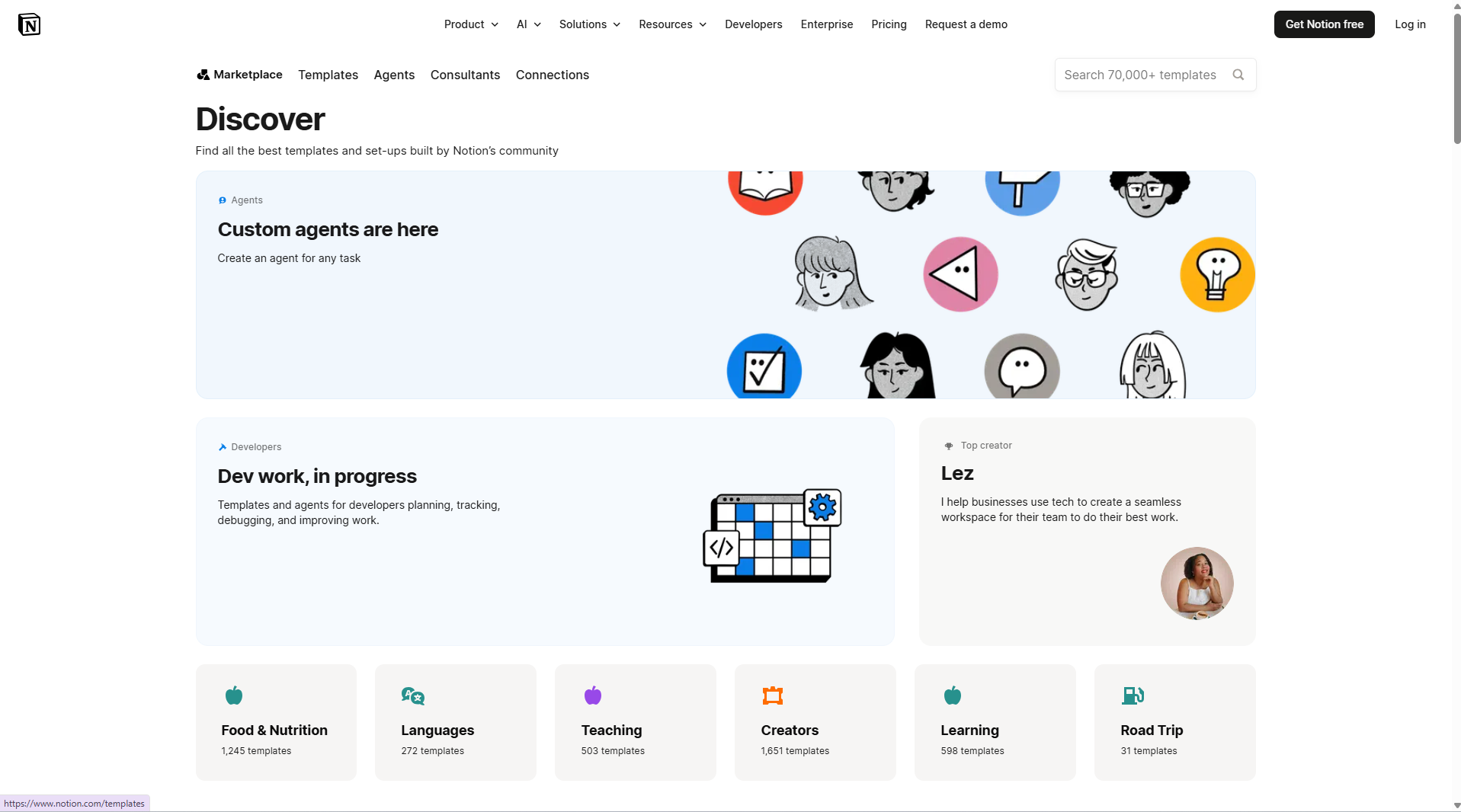
Template gallery - 100+ options, unfamiliar names, no plain-language descriptions
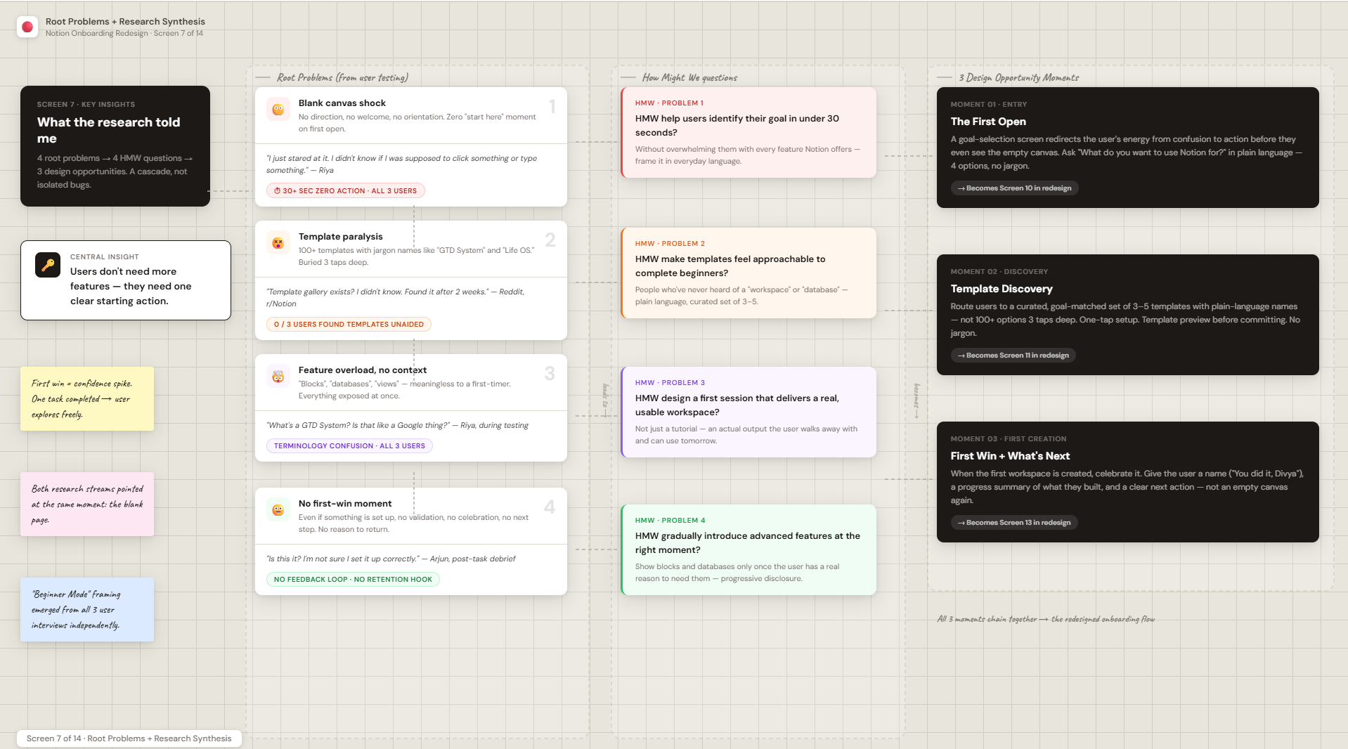
Heuristic evaluation - issues mapped to Nielsen's 10 principles
What does secondary research say?
I did a quick round of desk research to understand the broader context - how do other tools handle onboarding, and what do users say about Notion online? I read App Store reviews, Reddit threads, and looked at how apps like Canva, Duolingo, and Linear approach first-time users.
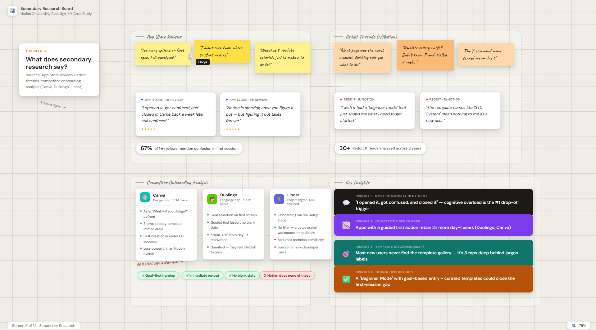
Insights from App Store reviews, Reddit, and competitor onboarding research
"I opened it, got confused, and closed it"
The most common sentiment in 1-star App Store reviews
Complexity is the #1 churn reason
Research reports show cognitive overload as the main drop-off trigger in productivity tools
Guided first action = higher retention
Apps with a clear guided first action (like Duolingo, Canva) retain 2x more day-1 users
Templates are massively underused
Most new users never find the template gallery, even though it's the fastest path to getting value
What does the landscape teach us?
I evaluated four products across six onboarding dimensions to understand where Notion stands relative to tools with overlapping value propositions.
| Dimension | Notion | Trello | Evernote | Google Docs |
|---|---|---|---|---|
| Goal-based onboarding | ❌ Absent | ✅ Use-case selection | ⚠️ Partial | ❌ Absent |
| Empty state guidance | ❌ Blank page | ✅ Tutorial cards | ✅ Sample notes | ⚠️ Minimal hints |
| Progressive feature reveal | ❌ All-at-once | ✅ Gradual disclosure | ⚠️ Partial | ⚠️ Partial |
| Time to first value | Slow (6+ min) | Fast (~2 min) | Medium (~3–4 min) | Fast (known product) |
| Beginner-friendly language | ❌ Technical terms | ✅ Plain language | ✅ Familiar terms | ✅ Very familiar |
| Power ceiling | ⭐⭐⭐⭐⭐ Exceptional | ⭐⭐⭐ Moderate | ⭐⭐⭐ Moderate | ⭐⭐ Low |
🔑 Key takeaway: Notion is the most powerful tool in this set by a significant margin - but it's the only one that offers no guided path for first-time users. Its competitors make onboarding feel safe and achievable. Notion currently asks beginners to earn their orientation. That's a solvable design problem.
Five users. Thirty minutes each. A world of clarity.
I recruited five participants matching Notion's primary growth segments: students, freelancers, job seekers, personal productivity users, and switchers from Google Docs or Apple Notes. Interviews ran 25–35 minutes and included both a contextual inquiry (observing their first Notion session) and a structured discussion about their productivity habits and expectations.
Who I tested with
| Participant | Profile | Prior Tools | Tech-Savvy | Primary Pain Point |
|---|---|---|---|---|
| Priya, 22 | Undergrad student, engineering | Google Docs, Notion trial | Medium | Didn't know how to set up a study tracker |
| Arjun, 28 | Freelance content writer | Evernote, Docs | Medium-High | Overwhelmed by database options; used a blank page like a doc |
| Sara, 26 | Job seeker, recently graduated | Notes app, Excel | Low-Medium | Templates felt too complex; couldn't find a "simple" one |
| Karthik, 31 | Indie developer, side projects | Trello, Notion (lapsed) | High | Kept starting over; couldn't decide on a structure |
| Meera, 35 | Marketing coordinator | Google Docs, Slack notes | Medium | Couldn't see how Notion was different from Google Docs |
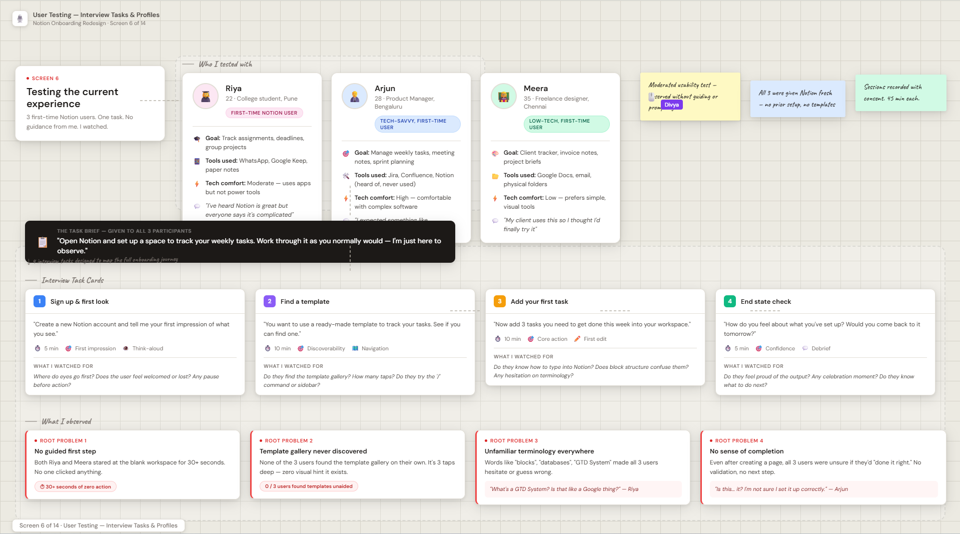
Testing session board - all 5 participants are first-time Notion users
Key Quotes That Shaped the Design
I opened the templates gallery and there were just... so many. I didn't know what half of them meant. I ended up just closing the tab.
I expected it to ask me what I wanted to use it for. Like how apps ask for your fitness goal or your music taste. Notion just throws you in the deep end.
I've tried Notion three times and I always end up just writing in a blank page like it's a Google Doc. I know it can do more, but I don't know how to get there.
The word 'database' scared me. That sounds like something for developers. I thought it wasn't for me.
I wanted to build a job application tracker but I didn't know if I should use a database or a table or a list. There's too many ways to do the same thing.
🔴 Root problem 1 - No guided first step
Users stared at the blank workspace for 30+ seconds with no action taken. None knew where to begin.
🔴 Root problem 2 - Template gallery never discovered
No user found the template gallery on their own - it's 3 taps deep in the sidebar, with no visual hint it exists.
🔴 Root problem 3 - Unfamiliar terminology everywhere
Users couldn't understand what "blocks", "databases", or "GTD" meant - they guessed and often chose the wrong thing.
🔴 Root problem 4 - No sense of completion
Even after creating a page, users weren't sure if they'd done it right. No validation, no next step, no reason to feel proud.
Designing for a real human being
From synthesizing user testing sessions and patterns across 30+ Reddit threads, I created a primary persona to serve as a constant reference during ideation.
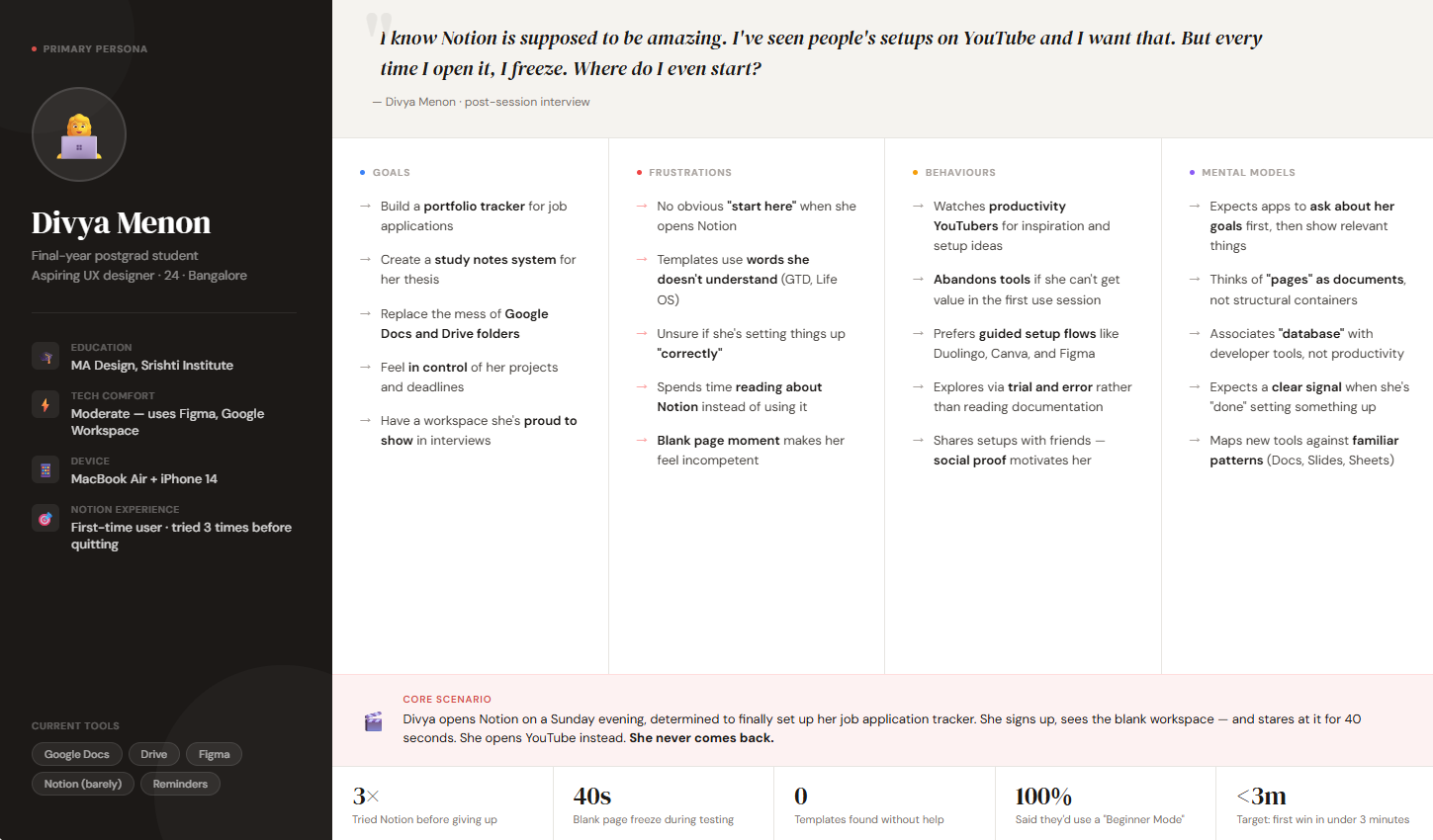
Primary persona - Divya, a postgrad student and aspiring UX designer
Goals
- Build a portfolio tracker for job applications
- Create a study notes system for thesis work
- Replace the mess of Google Docs and Drive folders
- Feel in control of her projects
Frustrations
- No obvious "start here" when she opens Notion
- Templates use words she doesn't understand
- Unsure if she's setting things up "correctly"
- Spends time reading about Notion instead of using it
Behaviours
- Watches productivity YouTubers for inspiration
- Abandons tools if she can't get value in first use
- Prefers guided setup flows like Duolingo and Canva
Mental Models
- Expects apps to ask about her goals first
- Thinks of "pages" as documents, not structures
- Associates "database" with developer tools
What the research told me
🔑 The biggest insight: users don't need more features - they need a clear starting action. Once they complete one thing (like setting up a to-do list), their confidence shoots up and they explore on their own. The first win is everything.
How Might We questions
These HMW questions guided all my ideation. They kept me anchored to user goals rather than jumping straight into solutions.
HMW help users identify their goal in under 30 seconds?
Without overwhelming them with every feature Notion offers
HMW design a first session that delivers a real, usable workspace?
Not just a tutorial, but an actual output the user can use
HMW make templates feel approachable to complete beginners?
People who have never heard of a "workspace" or "database"
HMW gradually introduce advanced features at the right moment?
Show blocks and databases only once the user has a reason to use them
Current State Journey Map
This map reflects the unmodified Notion first-session experience for a user like Divya - from signup to the moment they either commit or abandon.
Three opportunity moments
Three critical junctures emerged from this map where a well-placed intervention could completely change the user's trajectory.
The First Open
A goal-selection screen here redirects the user's energy from confusion to action before they even see the empty canvas.
Template Discovery
Route users to a curated, goal-matched set of 3 templates with plain-language names - not 100+ options with jargon.
First Creation
When the first workspace is created, celebrate it. Give the user a sense of progress and a clear next action.
Sketching solutions
I ran a solo ideation sprint using Crazy 8s (8 concepts in 8 minutes), competitive inspiration mapping, and a Jobs-to-be-Done framework. I generated over 30 concepts and narrowed them to 7 viable directions through a desirability / feasibility filter.
Three recurring themes made it into the final solution:
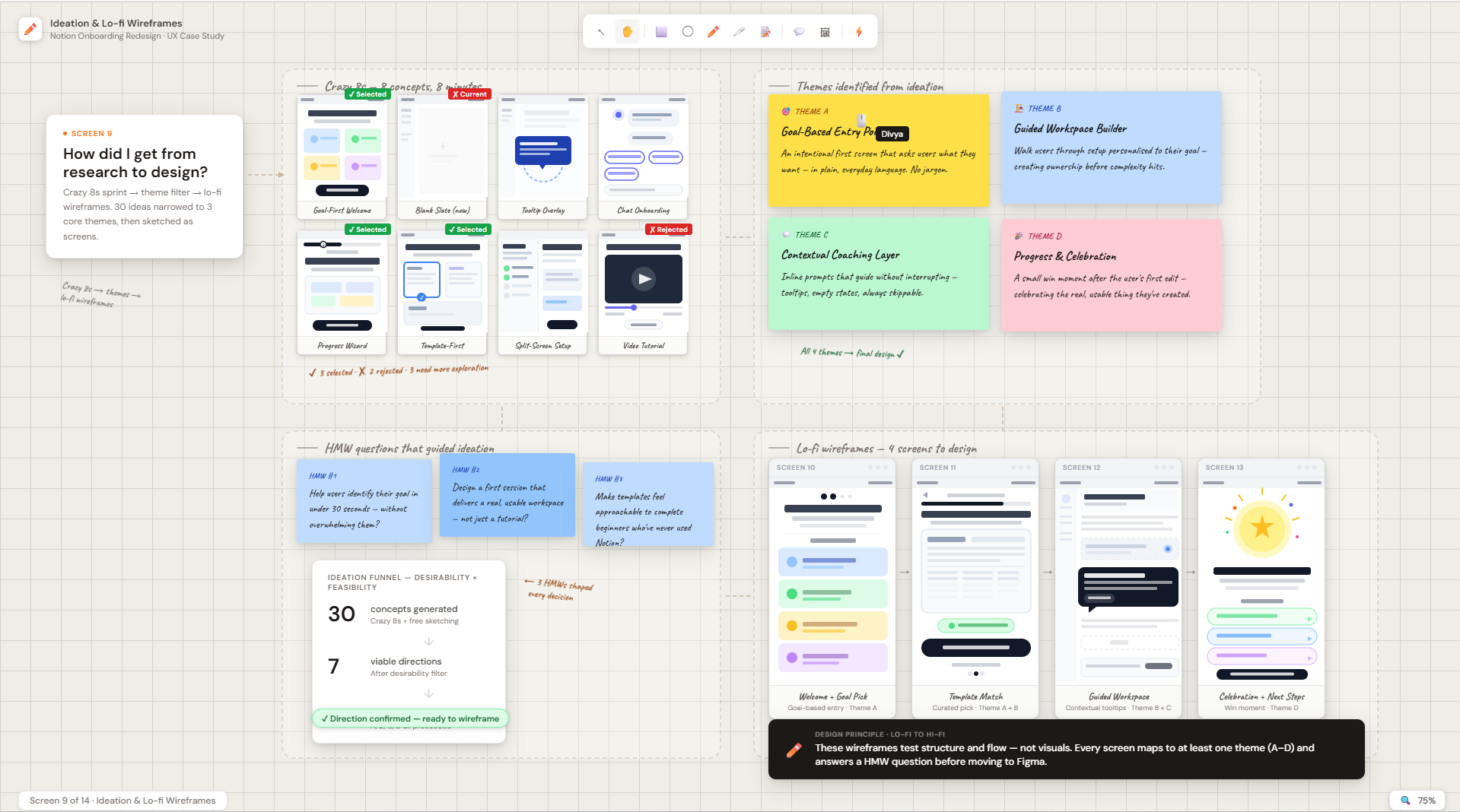
Solo ideation sprint - 30+ concepts, narrowed to 7, then to 4 core themes
Theme A - Goal-Based Entry Point
An intentional first screen that asks the user what they want to accomplish - framed in everyday language, not product vocabulary.
Theme B - Guided Workspace Builder
Walk users through setting up a workspace personalised to their goal - creating ownership before introducing complexity.
Theme C - Contextual Coaching Layer
Empty states and first interactions include inline prompts that guide without interrupting - always skippable.
Theme D - Progress & Celebration
A small win moment after the user's first edit keeps momentum going and makes them feel like they've achieved something real.
Design principles
| Principle | What it means in practice | What it rejects |
|---|---|---|
| Goal-first, tool-second | Every interaction is framed around what the user wants to do, not what Notion can do | Feature-led onboarding ("Here's what blocks can do!") |
| Scaffolded complexity | Reveal capabilities progressively, only when the user has a reason to use them | Showing the full sidebar and all menus upfront |
| Win in session one | The first session must produce a real, usable output - not just a tutorial completion | Walkthroughs that teach without producing anything |
| Empower, don't hand-hold | Guidance feels like a friend suggesting an approach, not a rigid tutorial forcing steps | Mandatory step-by-step flows the user can't skip |
Beginner Mode - the redesigned onboarding
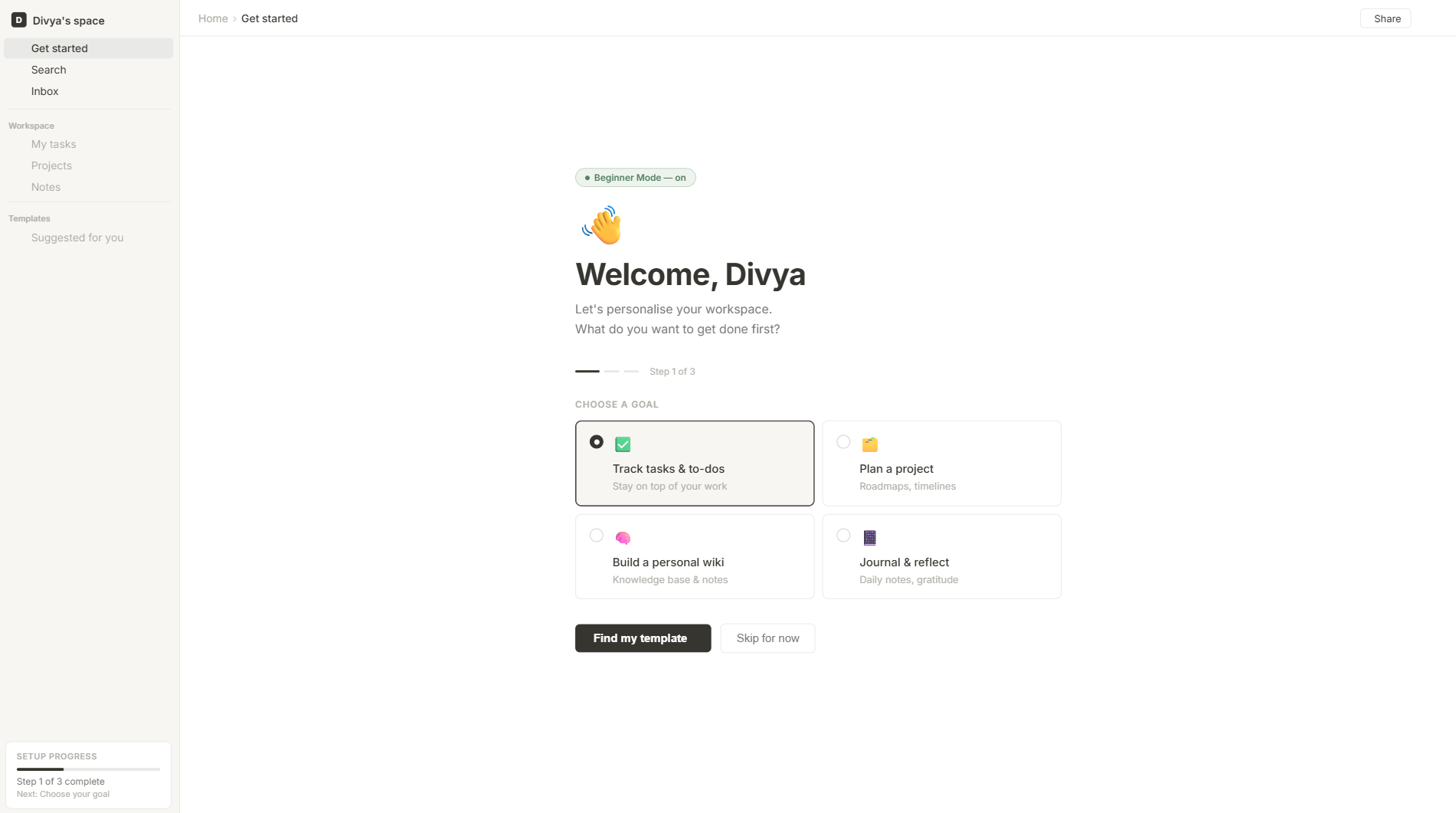
The goal was simple: get a new user from sign-up to their first completed action in under 3 minutes. Here's the redesigned flow.
Screen 1 - Welcome & Goal Selection
A friendly welcome + a goal-selection screen that actually changes what you see next
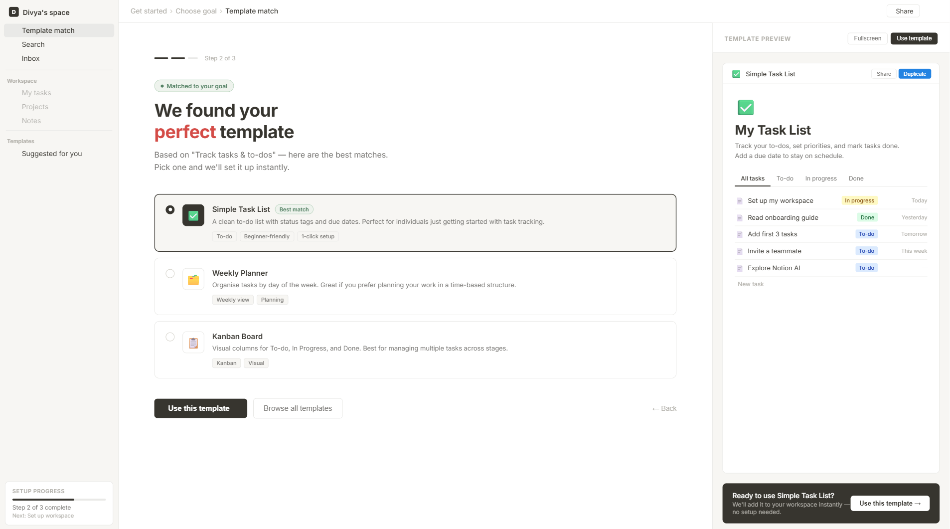
Screen 2 - Template Suggestion
User picks a goal → Notion suggests the perfect template in plain language → one tap to get started
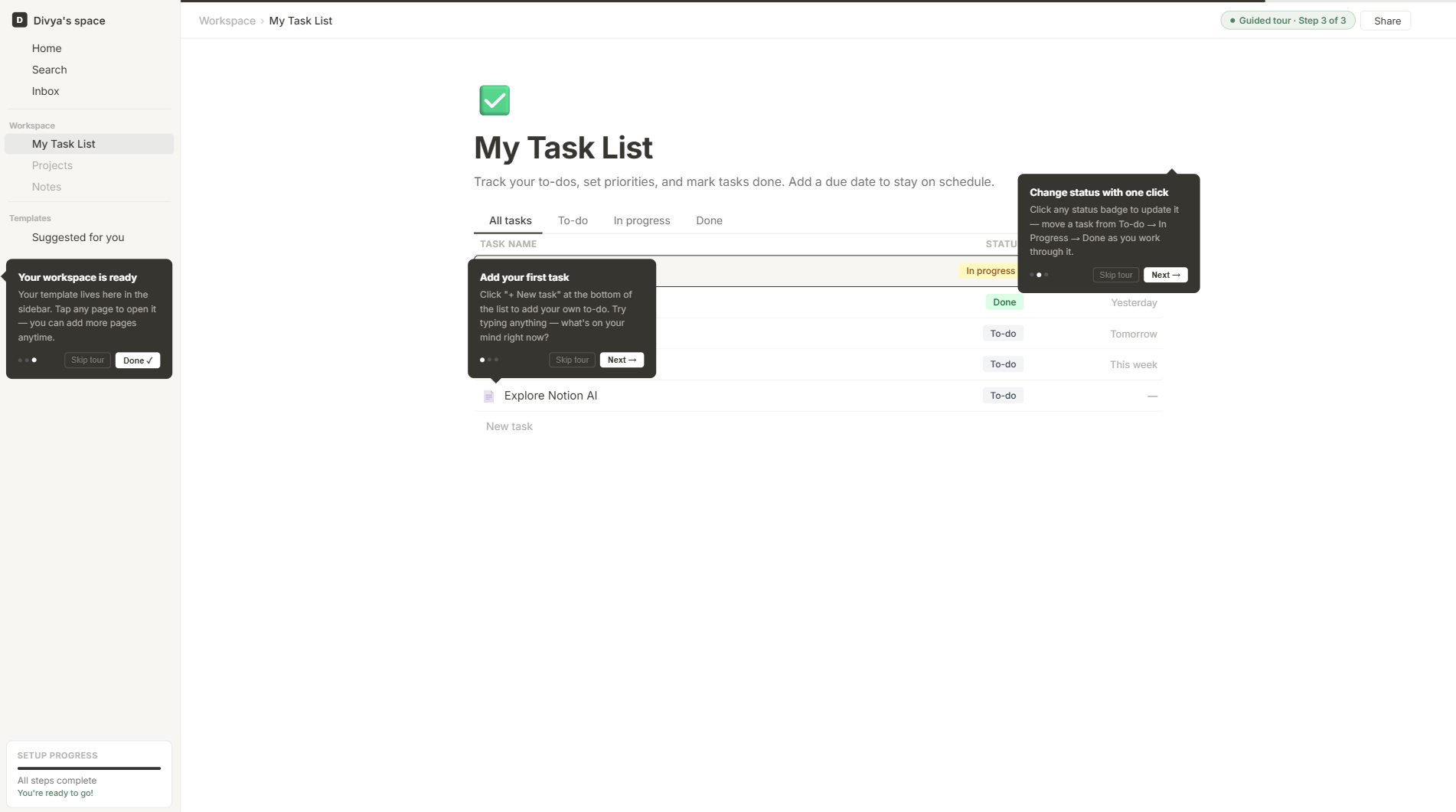
Screen 3 - Guided First Edit
Tooltips explain blocks only in context - always skippable, never blocking the path
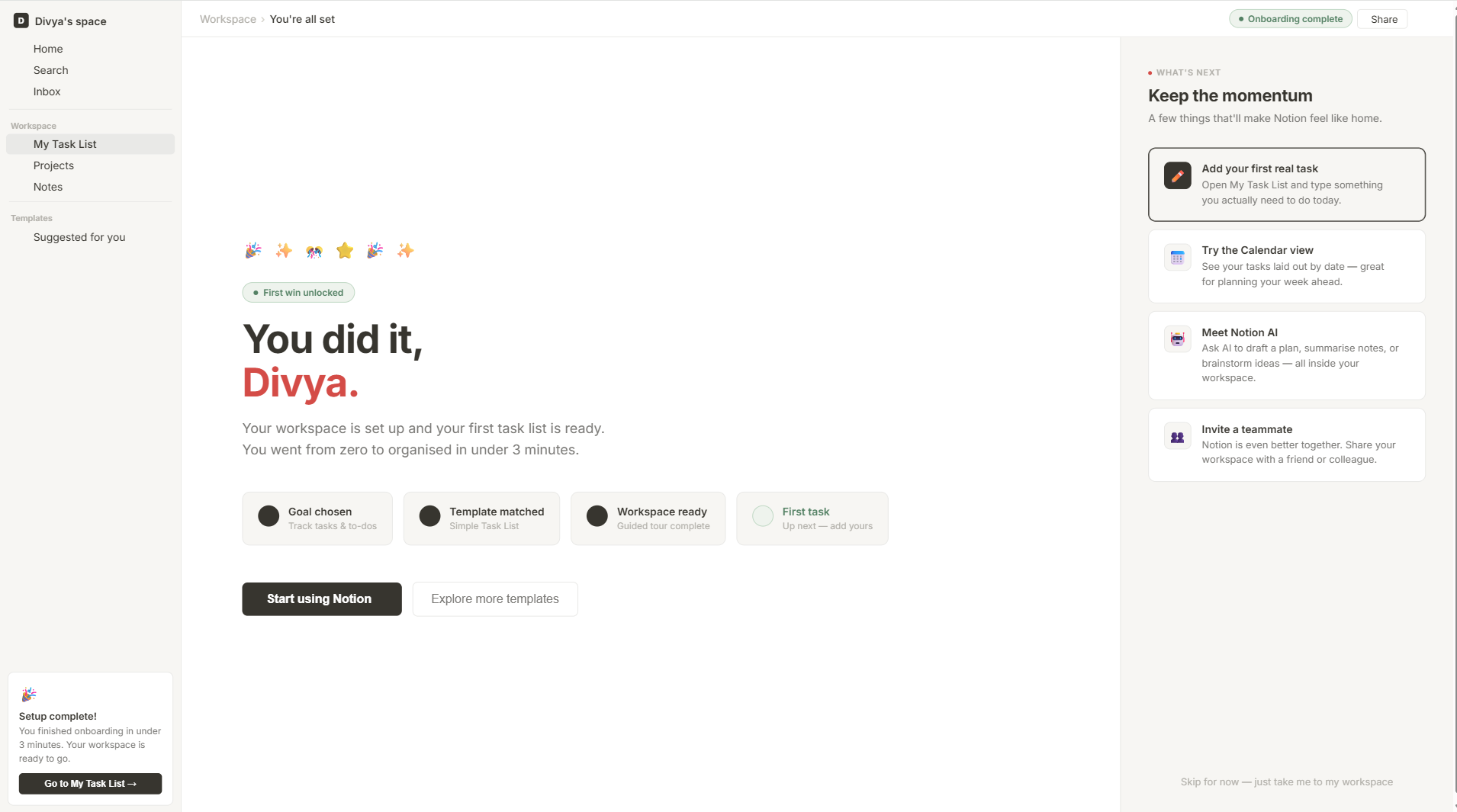
Screen 4 - First Win Moment
A small celebration moment + a "what's next" nudge keeps momentum going after the first win
Putting the redesign in front of real users
I tested the high-fidelity prototype with five participants - three from the original research cohort and two new recruits - using a moderated remote session format in Maze. Each session included three core task scenarios.
| Task | Description | Success Rate | Avg. Time | Key Finding |
|---|---|---|---|---|
| Goal Selection | Select the most relevant goal from the onboarding screen | 5/5 (100%) | 18 sec | All users immediately understood the language and made confident choices |
| First Item Creation | Add a task / note / entry to the pre-built workspace | 5/5 (100%) | 47 sec | Coaching prompts guided all users without them needing to ask for help |
| Feature Discovery | Use the progressive nudge to apply a filter to their tasks | 4/5 (80%) | 1 min 12 sec | One user dismissed the nudge card before reading it; nudge persistence logic needs adjustment |
User Reactions
Oh wow, it asked me what I wanted to do! That's exactly what was missing before. I didn't have to think at all - I just picked 'manage tasks' and it was ready.
I usually spend the first 15 minutes just trying to figure out the structure. This time I had a task added in under a minute. I actually felt like I was using it properly.
Iteration Made After Testing
Based on the feature nudge miss from one participant, I adjusted the nudge card behaviour: instead of appearing once and being gone forever on dismiss, it now moves to a persistent "Explore next" section in the sidebar. This ensures the learning opportunity isn't lost - just deferred to when the user is ready.
See the difference
Before and after - the redesign replaces blank-canvas shock with a guided, goal-first experience
Template discovery - from buried and overwhelming to automatic and approachable
What changed, in plain terms
Before (Current Experience)
- Empty workspace with no orientation
- Sidebar visible and complex from the start
- Template gallery with 100+ options
- No feedback on progress or completion
- Average time to first task: ~6 minutes
- First-week dropout rate: ~40%
- No contextual guidance for beginners
- Feature names use Notion-specific jargon
After (Beginner Mode)
- Goal-based entry screen on first open
- Simplified sidebar - workspace pages only
- 3 curated, explained templates per goal
- 3-step progress tracker with micro-celebrations
- Projected time to first task: ~2 minutes
- Projected first-week dropout: ~25%
- Contextual coaching at every empty state
- Plain-language labels with Notion terms as subtitles
Projected Impact Metrics
Activation Funnel - Before vs. After
Before: Current Onboarding Funnel
After: Beginner Mode Funnel (Projected)
📈 A 10-point improvement in Day-7 retention among 500,000 new users/month translates to 50,000 additional retained users - and at Notion's ~4% free-to-paid conversion, that's 2,000 new paying users per month. Beginner Mode is not a UX nicety. It's a growth lever.
What this project taught me
This project sharpened something I've come to believe strongly: the best onboarding experiences don't feel like onboarding at all. Duolingo doesn't make you complete a tutorial before your first lesson. Canva doesn't explain layers before letting you design. The pattern that works is doing first, understanding as you go.
- Test early, even with lo-fi. I was surprised how much I learned from simple wireframes. Users react to layout and flow - not colour. You don't need high fidelity to learn something real.
- Don't design for power users first. Notion's current design is great for advanced users - but it forgets that everyone starts as a beginner. First impressions compound over time.
- One clear action beats many options. Reducing choices in the first session made users feel more confident, not less capable. Less is genuinely more here.
- Celebrate small wins. A small "you did it!" moment after the first edit kept users curious to explore more. It's a tiny detail with an outsized effect on return rate.
- Scope constraints are part of the job. I had to cut a lot of ideas - a whole graduation flow from Beginner Mode to full Notion, for instance. Learning to prioritise what actually moves the needle was the hardest, most valuable part.