Understanding the Domain
Furniture commerce has a spatial uncertainty problem that no amount of product photography resolves. A buyer can see a sofa in a studio shoot, in a lifestyle render, and in five angles of detail photography - and still not know whether it will fit the corner of their actual living room, whether the proportions will look right against their walls, or whether the scale they are imagining will match the room they go home to.
This uncertainty drives two compounding failure modes. The first is abandonment: a buyer reaches the product page, cannot confirm spatial fit, and defers the decision indefinitely. The second is returns: a buyer commits without spatial certainty, receives the furniture, and discovers the mismatch - triggering a return process that costs 15–20% of product value in logistics and restocking.
Augmented reality is the structural solution to the spatial uncertainty problem. But the existing implementations - IKEA Place, Amazon AR View, Pepperfry's experimental integration - all surface AR as a secondary feature, accessible only after the user has already formed a purchase position. WoodSpace is built on a different premise: AR must enter the decision flow before spatial doubt solidifies, not after a cart has already been abandoned.
Why This Problem Matters - Business Impact Categories
| Problem Category | Business Consequence | Frequency | Impact |
|---|---|---|---|
| Spatial Mismatch at Purchase | Return rate 15–20% of product value; restocking and logistics cost | Very High | Critical |
| AR Buried in Product Detail | Buyers abandon before accessing spatial verification - the core value | High | Critical |
| No Multi-Brand AR Marketplace | Buyers use AR tools and catalogue apps separately; no end-to-end journey | High | High |
| UI Competing with Camera Feed | AR placement accuracy degrades; purchase confidence not delivered | High | High |
| Single-Brand AR Limitation | Comparison shopping impossible within an AR-native experience | Medium | High |
| Checkout Friction Post-AR | Purchase intent formed in AR is lost in complex or slow checkout flow | Medium | High |
A marketplace problem, not a feature problem.
The surface-level problem is that online furniture shopping has high return rates and low purchase confidence. The underlying problem is that spatial verification - the one capability that resolves purchase anxiety - is either absent, or present but positioned as a secondary feature that buyers access only after they have already made a tentative decision.
Existing apps treat AR as a utility you use to confirm a decision already made. WoodSpace is built on the opposite premise: AR is the mechanism by which the decision is made. These two positions produce radically different interface architectures.
The second layer of the problem is marketplace scope. IKEA Place proves AR placement works. But IKEA Place is a single-brand utility tool. At marketplace scale - multiple brands, thousands of SKUs, a discovery layer the user did not arrive with intent - the design problem is fundamentally different. Seller 3D asset quality determines buyer AR experience quality. The buyer interface and the seller relationship are not separate design problems. They are the same dependency loop.
Platform Architecture · Two-Sided Marketplace · Core Dependency
Consumer
- · Browse multi-brand catalogue
- · AR placement in real space
- · Customise finish & dimension
- · Purchase with spatial proof
- · Track order delivery
Marketplace
- · 3D model library & AR engine
- · Seller catalogue management
- · Buyer discovery & search
- · AR placement interface
- · Purchase & checkout flow
Furniture Brand
- · Upload product catalogue
- · Commission 3D / AR models
- · Manage inventory & pricing
- · Fulfil orders & returns
- · Access buyer analytics
The product hypothesis: AR-verified placement at the decision moment reduces spatial uncertainty → reduces return rates → increases purchase confidence. Every interface decision in WoodSpace is traceable to this hypothesis. A design decision that makes AR harder to access contradicts the product premise.
Six findings that shaped every interface decision.
Research combined qualitative interviews with five participants across buying and professional interior design contexts, first-hand testing of four competitor AR apps, and secondary review analysis across Google Play Store, Quora, Reddit, and Trustpilot - filtering for furniture-specific AR complaints and unmet needs across 100+ reviews.
The objective was not to confirm the product hypothesis. It was to understand the specific failure modes in existing AR furniture experiences well enough to design against them - not just around them.
4 of 5
participants cited spatial uncertainty as primary blocker
Finding 01
Spatial uncertainty, not price, is the primary driver of furniture purchase abandonment.
Across qualitative interviews and secondary review mining, the dominant reason for cart abandonment and deferred purchase was not cost - it was an inability to confirm fit. Buyers described the core anxiety as: "I cannot know if this will look right until it is already in my room." This anxiety cannot be resolved by better product photography. It requires spatial verification.
3 of 4
test sessions: AR found after doubt had formed
Finding 02
AR is surfaced too late in existing apps - after the decision has already been deferred.
In competitor app testing across IKEA Place, Pepperfry, and Amazon, AR placement was accessed through a secondary icon on the product detail page. In 3 of 4 test sessions, participants had already formed a "maybe not" position before they found the AR entry point. The value proposition of AR is only realisable if it enters the decision flow before spatial doubt solidifies into abandonment.
100%
of AR usability complaints traced to UI-over-camera conflict
Finding 03
The interface competing with the camera feed is the single largest AR usability failure.
Participants using warm-accent UI apps in mixed or low lighting described the AR experience as "hard to read" and "the app keeps getting in the way." The UI chrome - navigation bars, action buttons, overlaid labels - competed visually with the furniture model in the camera feed. The interface must recede when the camera is active. This is not a preference. It is the technical precondition for AR to deliver its value.
4 items
visual memory threshold for recent search recall
Finding 04
Search recall for furniture is image-first for recent searches, text-first beyond four items.
When asked to recall items they had browsed, participants consistently identified recent searches by visual memory ("the beige sofa with wooden legs") rather than product names. Beyond approximately four items, this visual recall degraded and participants used category or style words. This directly shaped the search history architecture: thumbnails for the first four recent items, text chips thereafter - aligned to how furniture shopping recall actually works.
6 of 8
had returned furniture - all due to spatial mismatch
Finding 05
Returns are treated as an inevitable tax on online furniture shopping - not as a design failure.
Six of eight participants described having returned furniture purchased online in the last 12 months. None attributed this to poor product quality. All attributed it to the furniture "not looking right in my space." The acceptance of high return rates as normal is the market signal that the spatial verification gap is structural, not incidental. A platform that reduces return rates through AR-confirmed placement has a measurable business case, not just a UX improvement.
2 constraints
colour scheme and overlay density - shaped every AR screen decision
Finding 06
Colour scheme and interface density are the two biggest cognitive load contributors during AR.
Participants testing competitors in warm-palette interfaces described visual fatigue during AR sessions. Dense UI overlays with multiple simultaneous options created decision paralysis at the moment requiring spatial focus. The two design constraints that followed: a dark monochrome base (neutral under camera conditions) and a minimal AR overlay (single active action at any step in the placement flow).
Two users. Two entry points into the same spatial uncertainty problem.
The buyer persona and the professional designer persona differ in context - one furnishes their own space, one furnishes client spaces - but both hit the same structural wall: they cannot commit to a purchase decision without spatial proof, and existing tools do not give them that proof before the decision has already been deferred.
P01 · Busy Professional
Aman Kumar
35 · Marketing Manager · Recently relocated to Bengaluru
New apartment · Minimalist taste · Needs to furnish quickly
Goals
Visualise how specific furniture will look in his actual room without store visits
Confirm dimensions and spatial fit before committing to a purchase decision
Complete the full discovery-to-checkout flow within a single, efficient session
Access reliable delivery timelines and hassle-free returns if AR placement misleads
Pain Points
Spends hours browsing catalogues only to discover items do not fit the intended space after delivery
Return processes are slow and costly - he avoids them by deferring purchase entirely
App interfaces overwhelm him with options; he wants to find, verify, and buy - in that order
AR features buried behind multiple taps; he abandons before ever accessing the core value
Behaviours
P02 · Interior Designer
Samyuktha
32 · Interior Designer · Mumbai
Client-facing practice · Multiple active projects · Presentation-dependent
Goals
Present furniture options in context to clients - visualised in the actual room, not a showroom render
Access a broad enough product range to satisfy diverse client briefs from a single platform
Customise materials, finishes, and dimensions within the AR environment before client sign-off
Compare multiple pieces in the same space without switching between apps or leaving the room view
Pain Points
Client approval delays when furniture selections are presented as flat images without spatial context
No platform combines catalogue breadth with AR quality; must use two tools and reconcile manually
AR performance degrades in complex room lighting - exactly the kind of real-world condition she works in daily
No way to share a saved AR placement for async client review; every presentation requires her physical presence
Behaviours
AR Purchase-Confidence Funnel · Where the Decision Is Won or Lost
Not organised around navigation. Organised around the AR entry point.
The core architectural decision was this: every surface in the app must provide a path to the AR placement screen within one tap of any product view. AR is not a subsection. It is the axis around which the entire information architecture is organised.
The AR entry point is not a button inside a product page. It is the primary CTA of every product-facing surface in the app: catalogue cards, search results, explore feed, wishlist, and product detail. If a user can see a product, they are one tap from placing it in their space.
Five primary surfaces map to distinct user intents. Home surfaces discovery and inspiration. Explore provides browse-led discovery at masonry-feed depth. Product + AR is the conversion surface - where spatial proof converts consideration into purchase. Cart manages the post-decision flow. Profile handles account and order management.
Information Architecture · Five Surfaces · AR-Centric Organisation
Not "better than IKEA Place." Different.
The competitive analysis question is not who is in the market. It is what each competitor proves is possible and where they structurally cannot go. Each competitor's gap is not a criticism - it is a structural constraint that defines WoodSpace's addressable space.
Competitive Analysis · Where Every Existing Platform Structurally Cannot Go
Key Opportunities Identified
Entry Point
AR as primary CTA, not secondary icon
Surface the AR placement action as the first action on every product view. Not below the cart button. Above it.
Interface
Dark monochrome UI recedes for the camera
A dark neutral interface does not compete with the camera feed. The UI must disappear when AR is active.
Search
Visual recall–aligned search history
Recent searches shown as image thumbnails up to four items; text chips thereafter. Maps to actual recall behaviour.
Placement
Measured placement, not tap-to-place
A four-step measure-before-place flow guarantees spatial accuracy. Precision is the product value.
Discovery
Masonry explore feed for discovery browsing
Furniture is an aspirational category. Discovery-led browsing requires a different layout than intent-led search.
Marketplace
Multi-brand with seller 3D asset dependency named
The buyer experience quality is a function of seller 3D investment. This dependency is named, not hidden.
Three primary flows - each structured around the AR moment.
Each flow is defined not just by the steps a user takes, but by where AR enters the sequence and what it needs to deliver at that point. The AR placement step is never optional - it is the structural guarantee of the purchase confidence hypothesis.
Discovery to AR Placement to Purchase
Actor: Buyer (Aman Kumar) · Trigger: User opens app to furnish a new apartment
Onboarding & location permission
User completes login via mobile number - the lowest-friction path to the core experience. Location is requested with explicit context: "to provide better services in your area." No dark patterns. No deferred permission requests that confuse the AR flow later.
Home discovery: categories and new arrivals
The home screen surfaces New Arrivals, Shop by Product, Shop by Room, and curated user stories. The layout follows visual hierarchy - primary discovery pathways above the fold. The interface is dark (#18181C base); no warm tones that would compete with the camera feed in AR mode.
Search with visual-recall architecture
User searches for a product. The recently viewed section shows the last four items as image thumbnails - matched to visual recall. Prior searches appear as text chips. The interface knows which memory mode the user is operating in and matches its display to it.
Explore masonry feed for discovery browsing
User browses the Explore feed - a masonry grid with category carousel at the top. Products appear at different scales, editorial-style. "Shop the Room" contextual sections appear inline. This is discovery-led browsing, not intent-led search. The layout communicates the difference.
Product detail: 360° view and primary CTA hierarchy
User opens a product. The product detail page surfaces all relevant information - name, price, colour options, quantity, delivery, similar products. The primary action is "View in Your Space." Not the secondary icon. The first thing a user sees is the AR entry point.
AR placement: four-step measured flow
User enters the AR placement flow. Step 1: Measure the target space. Step 2: Confirm the measured area. Step 3: Place furniture at confirmed dimensions. Step 4: Adjust position and rotation with gesture control. The interface is minimal overlay on dark background - the AR model reads clearly against the camera feed. Spatial fit is confirmed, not approximated.
Real-time customisation within AR environment
User customises colour and finish within the AR view - not in a separate configuration screen. Changes render in the placed furniture in real time. The user sees the actual product in their actual space with their actual preferred finish. This is the spatial proof that resolves purchase anxiety.
Add to cart and checkout
User adds the spatially verified, customised product to cart and proceeds to checkout. Delivery address, payment method, and order review are staged across three screens. Payment confirmation and tracking order complete the flow.
Screens · Onboarding, Search & Explore
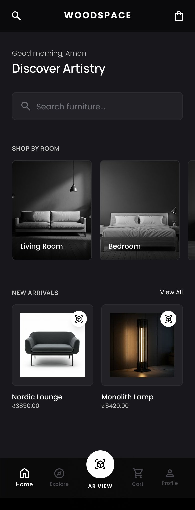
Onboarding - value prop
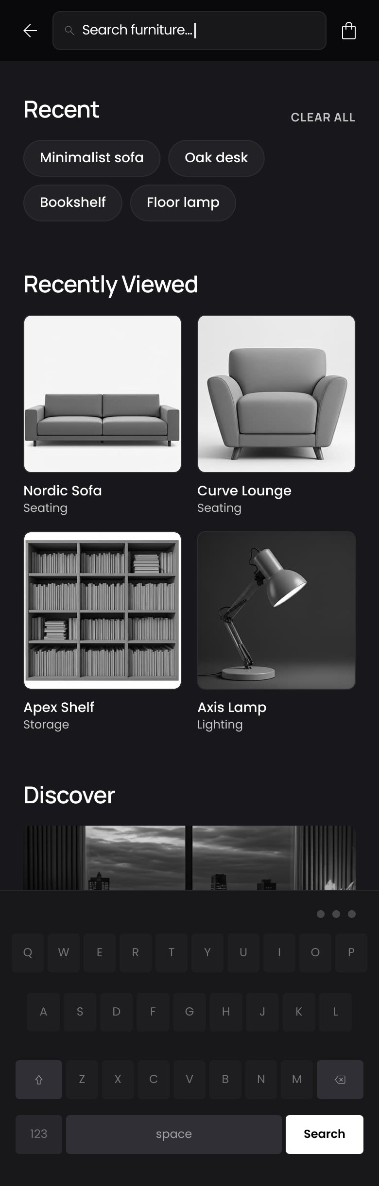
Search - recently viewed
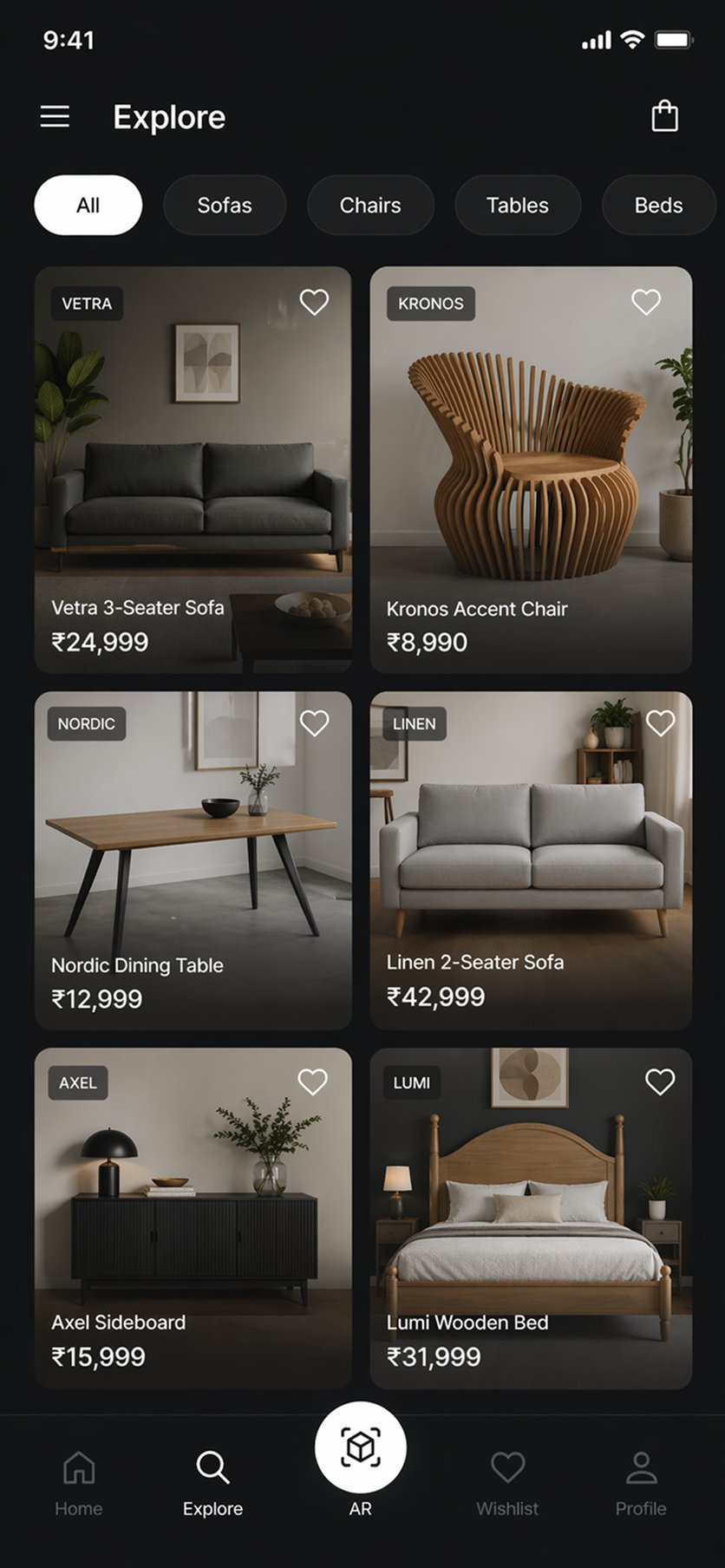
Explore - search and categories
AR Placement with Measurement Flow
Actor: Any buyer · Trigger: User selects "View in Your Space" from product detail
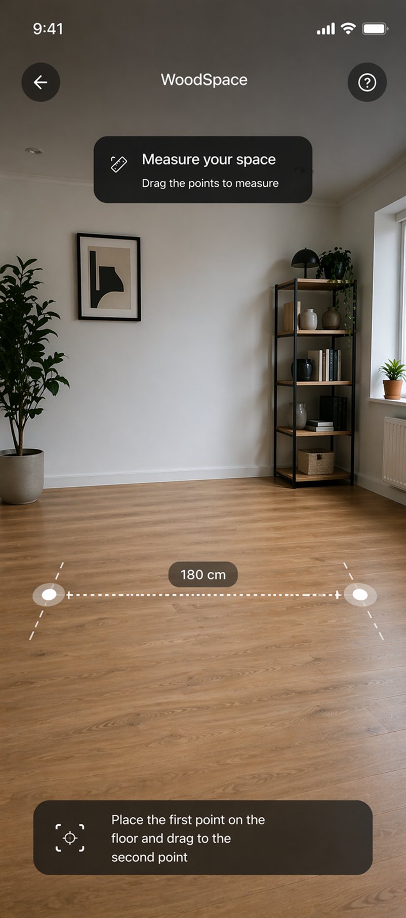
Camera access and surface detection
AR session initialises. Camera access is requested in context - immediately before the placement flow, not at app launch. Surface detection guidance appears as a minimal overlay: the interface stays out of the way while the device reads the room.
Measure the target area
User is guided to measure the space where they plan to place the furniture. Not an optional step. The measurement creates a spatial reference that ensures the AR model is rendered at accurate scale, not approximated by the device's surface detection alone.
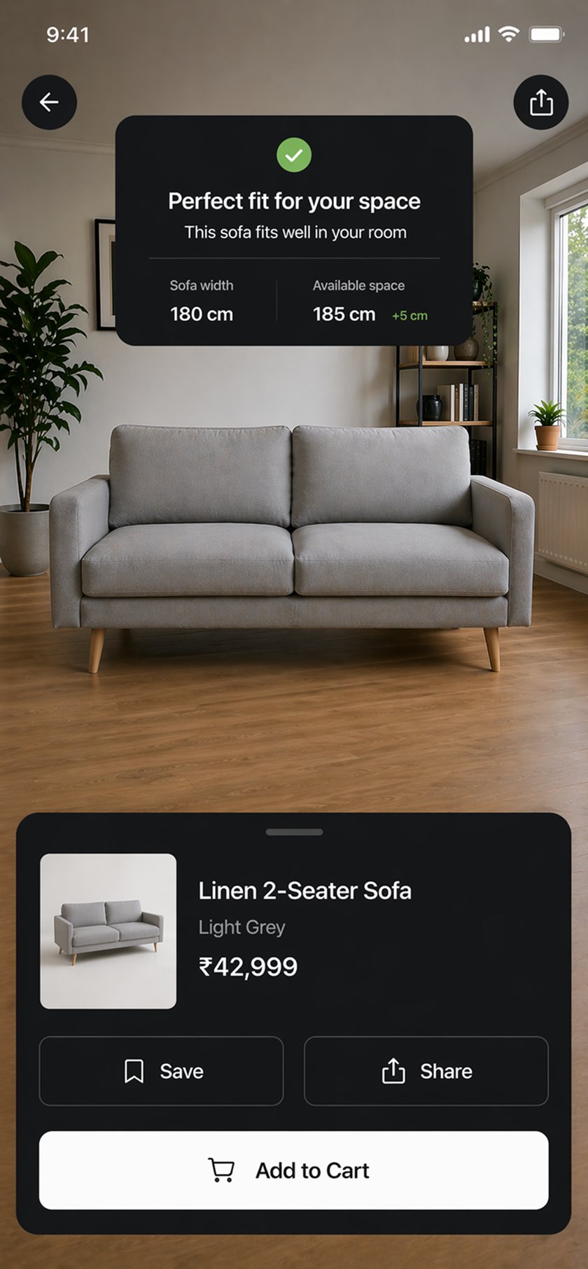
Confirm measured dimensions
Measured dimensions are presented for confirmation before placement. The user sees: space width × depth, and the furniture's dimensions. If the furniture does not fit, the user knows before they have committed emotionally to the placement.
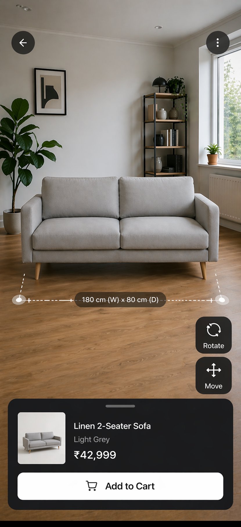
Place furniture at confirmed scale
Furniture is placed in the confirmed measured space at exact scale. The AR model renders at the precise dimensions of the product - not an approximation. The user can see, with confidence, whether the sofa fits the corner or the chair suits the desk space.
Adjust position and rotation with gesture control
User adjusts placement using pinch-to-scale and drag-to-reposition gestures. The UI overlay during this phase is minimal: single active action visible at any time. The camera feed - and the placed furniture - is the interface.
Real-time colour and finish customisation
Colour and finish options are accessible within the AR view without exiting placement. Changes render on the placed furniture in real time. User can compare two colour options in their actual room without switching screens.
AI Match Score and share
The AI Match Score surfaces an aesthetic fit assessment based on the room context and placed furniture. User can share the AR placement photo with family or compare before/after views. Spatial proof is shareable - relevant for professional designers presenting to clients.
Screens · Product Detail & AR Placement Flow
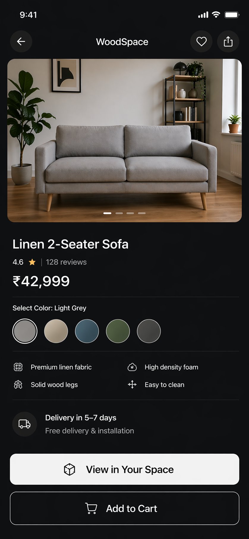
Product - details & specs
AR - Scan room
AR - Position sofa
AR - Material check
Post-AR Checkout and Order Tracking
Actor: Buyer · Trigger: User saves AR placement and adds product to cart
Save AR placement and add to cart
Post-placement, user can save the AR photo and add the confirmed product to cart in a single action. The transition from AR to cart is frictionless: the spatially verified product moves directly into the purchase flow without re-selecting variant or size.
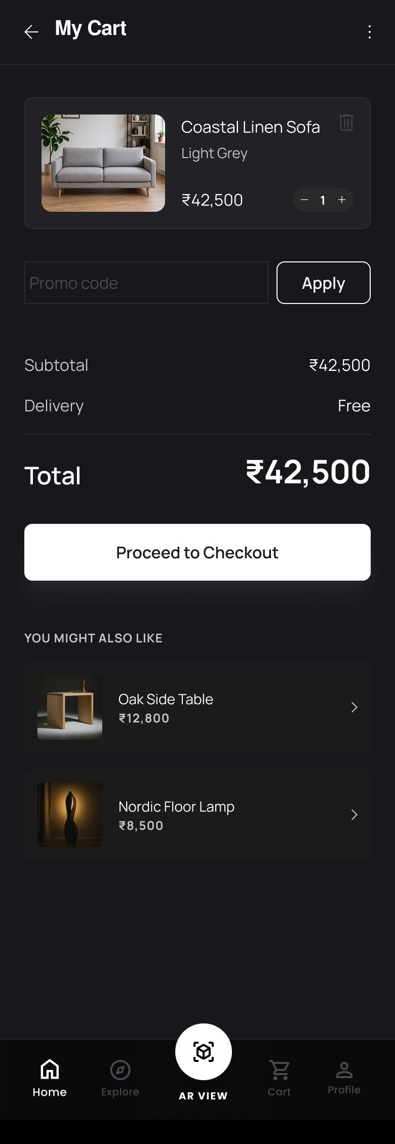
Cart review with offers and delivery estimate
Cart page surfaces the product with confirmed variant, price, offers, discounts, and delivery estimate. "More Like This" recommendations appear below the cart item - cross-selling is secondary to the conversion action, not competing with it.
Address entry and delivery scheduling
Checkout stages are separated: address first, then order review, then payment. Each screen has a single focus. Cognitive load at checkout is minimised - the user is not asked to hold multiple decisions simultaneously.
Payment and order confirmation
Payment screen surfaces all accepted methods clearly. Transaction ID and order confirmation are delivered immediately post-payment. The confirmation screen contains everything needed: confirmation, estimated delivery date, and the route to order tracking.
Order tracking
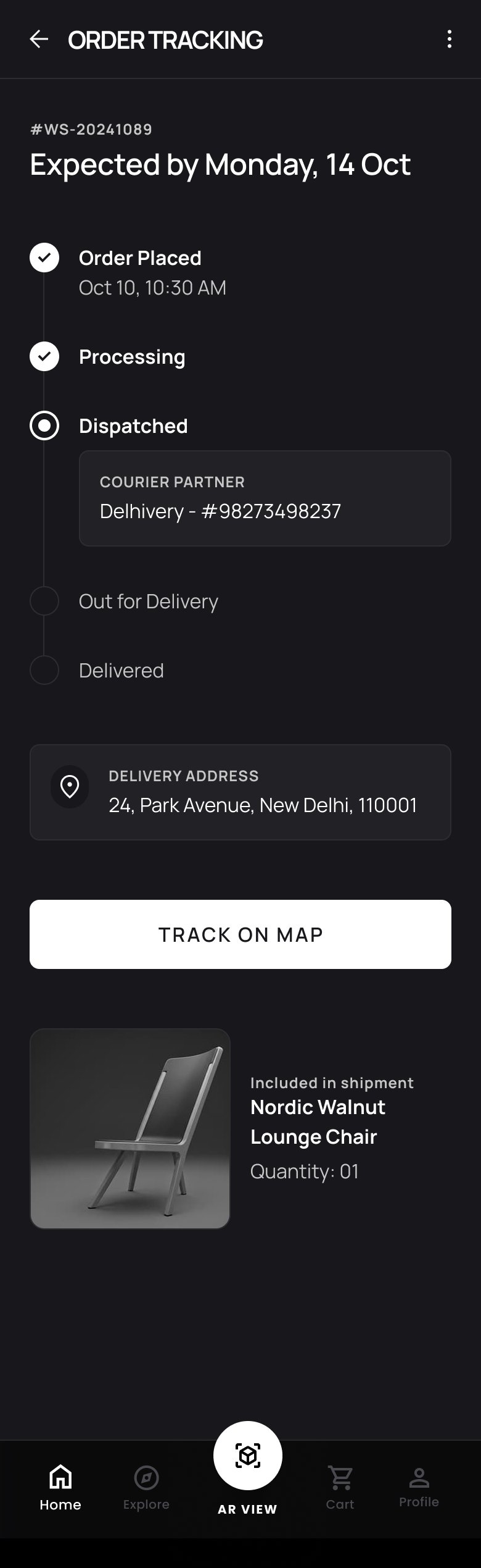
Order tracking surfaces the delivery journey across clearly staged milestones: Order Placed → Processing → Dispatched → Out for Delivery → Delivered. The user has visibility into the delivery state without needing to contact support.
Screens · Full Purchase Flow - Cart to Order Confirmation
Cart - review & offers
Checkout - address & details
Wireframing as a structural exercise, not a visual one.
The wireframing phase was driven by two questions for every screen: Where is the AR entry point, and how many taps from here? And: What is the single action this screen needs to enable, and what is everything else?
The V1-to-V2 home page iteration was the most structurally significant wireframing decision. V1 had a warm yellow accent, floating product images without containers, and a bottom navigation bar that did not match the colour scheme. V2 addressed each of these as a structural problem, not a visual preference. Dark monochrome for AR integrity. Contained product cards with a clear clickable affordance. Navigation bar redesigned to match the product's design language.
Home Page V1 → V2 - Layout Decisions
Change 01
Too much clutter - multiple competing options at launch
V2 reduces initial hierarchy: Search bar dominant, categories below, new arrivals below that. One decision at a time.
Change 02
Warm yellow accent (#FBB92B) conflicts with AR camera feed in mixed lighting
Dark monochrome base (#18181C). UI recedes when camera is active. Interface serves the AR, not the other way around.
Change 03
Floating product images without containers - no clear affordance
Circular containers for shop-by-product section. Clear visual boundary communicates tappability.
Change 04
Product images were too small and did not appear clickable
V2 product cards enlarged with arrow-equipped buttons. Affordance is explicit, not assumed.
Change 05
"Last Chance to Buy" section taking disproportionate visual weight
Moved into the Shop by Products section. Urgency signal is present without disrupting the primary hierarchy.
Change 06
User stories section felt generic - placeholder avatar images
Real user photos in gradient colour treatment. Authentic social proof rather than stock illustration.
Every V1-to-V2 change traces to the same constraint: the interface must serve the AR. A colour scheme that competes with the camera feed is not a visual preference problem. It is a product failure.
Five decisions. Each with a criterion.
The V1-to-V2 iteration is not documented here as "iteration happened." Each change is documented as a decision: what criterion drove it, what constraint shaped it, what the tradeoff was, and what the outcome evidence showed.
Six interface surfaces. One structural guarantee.
Every surface in WoodSpace is designed around a single structural guarantee: a user is never more than one tap from placing a product in their own space. This is not a navigation design principle. It is the product hypothesis expressed as an architectural constraint.
Home - Discovery Surface
User
Any buyer · First session or returning
Problem This Surface Solves
Buyers open the app with low intent - they are browsing, not searching. A search-first home page serves users who know what they want, not users who do not yet know what is possible.
Design Logic
The home page does not try to do everything. It does two things well: surfaces intent-led search, and creates discovery pathways for aspirational browsing. Every element on the page is either a search entry point or a discovery pathway - nothing else.
Search - Visual Recall Architecture
User
Returning buyer with recent browse history
Problem This Surface Solves
A user who browsed a sofa two days ago remembers it as an image, not a product name. A search history of twelve text chips requires the user to recall something they stored visually. The recall system is misaligned with how furniture shopping memory actually works.
Design Logic
The search history module is not a UI preference. It is an interface mapped to cognition. Presenting the right memory format at the right recall threshold reduces the friction between "I saw something I liked" and "I found it again."
Explore - Masonry Discovery Feed
User
Discovery-led browser · Aspirational shopper
Problem This Surface Solves
A uniform grid catalogue communicates "here is what we have, sorted by category." A masonry feed communicates "here is something you have not seen before." Furniture is an aspirational category. Discovery browsing is a valid and valuable user mode.
Design Logic
The masonry layout is WoodSpace's competitive positioning expressed in interface form. Single-brand apps cannot offer multi-brand cross-category discovery. The layout signals: this is a place for finding things you did not know you were looking for.
Product + AR - The Conversion Surface
User
Buyer at the decision point
Problem This Surface Solves
The product detail page is where spatial uncertainty either gets resolved or terminates in abandonment. If the AR entry point is not primary - not the first action a user sees - the product hypothesis has already failed before the user reaches it.
Design Logic
The action hierarchy on this page is a product decision, not an interface preference. The CTA that resolves the core user anxiety must be the most prominent action. Everything else is secondary.
Wishlist / Cart / Profile
User
Buyer managing post-decision flow
Problem This Surface Solves
After spatial proof is established, the purchase flow must not reintroduce friction. A complex or slow checkout reintroduces decision anxiety at the moment when commitment has already been earned.
Design Logic
Each checkout screen has exactly one decision to make. Address screen: where does it go. Order review: is this what I intended. Payment: confirm and complete. No screen asks the user to hold two simultaneous decisions.
Every token is a product decision.
The design system is not a style guide. It is the product hypothesis expressed in tokens. The colour palette is dark because AR requires it. The typography is Poppins because it reads cleanly in interface overlays. The grid system is 4-column at 360px because it accommodates both the explore masonry layout and the product detail density.
Design Tokens - Each with a Rationale
Colour Palette
#18181C · #838383 · #C7C7C7 · #E0E0E0
Dark monochrome. The interface must recede when the camera is active. Warm tones and mid-contrast elements compete with the AR camera feed. Dark neutral eliminates that competition entirely.
Typography
Poppins - all weights
Progressive, geometric, and emotionally legible at small sizes. Reads clearly in AR overlay mode where contrast must be managed against the camera feed and furniture model simultaneously.
Frame & Grid
360 × 800px · 4 columns · 12px gutter · 16px margin
Standard Android base frame with 4-column grid accommodates both masonry explore layouts and dense product detail screens within the same structural system without layout-specific overrides.
AR Overlay Principle
Minimum viable chrome during AR sessions
During the AR placement flow, only the active step's action is rendered in the overlay. No navigation bar. No product thumbnails. No persistent UI elements that compete with the camera feed. One action. One screen. One spatial task.
What the study confirmed. What the hypothesis predicted.
WoodSpace was a concept project and did not reach production. Usability testing involved five participants in moderated think-aloud sessions. Each participant completed the task of finding a product, placing it via AR in their current environment, and proceeding to checkout.
The core purchase-confidence hypothesis was confirmed: 4 of 5 participants reported higher purchase confidence after AR placement compared to standard catalogue browsing of the same product. The Explore feed generated longer session times than a grid catalogue in comparative testing - consistent with the discovery-led positioning hypothesis.
Purchase Confidence
Spatial proof converts consideration to commitment
The primary hypothesis confirmed: buyers who AR-place a product before adding to cart report measurably higher purchase confidence than buyers who browse without spatial verification. The mechanism is spatial certainty, not visual familiarity.
Return Rate Reduction
Confirmed fit before purchase eliminates post-delivery mismatch
The structural root cause of furniture return rates - spatial mismatch only discovered post-delivery - is eliminated when spatial verification occurs before the purchase decision. This is a business outcome, not a UX improvement.
Discovery Engagement
Masonry explore increases session depth versus grid catalogue
In comparative testing, the masonry explore feed generated longer sessions and more product interactions than a uniform grid catalogue. Discovery-led browsing is a distinct valuable user mode that grid layouts do not support.
Interface Recedes
Dark monochrome eliminates UI-over-camera conflict
The single largest AR usability complaint - interface elements competing with the camera feed - was structurally eliminated by the dark monochrome design language. No participant reported visual interference between UI and AR in V2 sessions.
Before & After - Per Persona
| User | Before WoodSpace | After WoodSpace |
|---|---|---|
| Aman - Busy Professional | Browses catalogue, forms position, adds to cart without AR. Receives furniture, discovers spatial mismatch. Initiates return. 2–3 week loss. | Views in Your Space before cart. Spatial fit confirmed at decision point. Purchase confidence is evidence-based. Return rate drops structurally. |
| Samyuktha - Interior Designer | Screenshots from one app, sends to client. Client cannot visualise in their space. Second meeting required. Project delays by days. | Places furniture in client's room via AR. Real-time customisation of colour and finish. Client approves in-session. No back-and-forth. |
| Any furniture buyer | AR option is a small secondary icon. Discovered after cart add. Spatial doubt already formed. AR does not convert abandonment back to purchase. | "View in Your Space" is the primary CTA. AR enters before doubt forms. Spatial certainty precedes the purchase decision, not follows it. |
| Returning user | Search history shows twelve text chips. Recalls recent browse as images not words. Cannot find the item they were considering. Session lost. | First four items shown as thumbnails. Visual recall matched to interface design. Items found in seconds. Session continues to purchase. |
Study Outcomes & System Achievements
4 of 5
participants confirmed higher purchase confidence post-AR placement versus catalogue browsing
1 tap
maximum distance to AR placement entry point from any product view - structural rule, not guideline
4-step
measurement-first AR flow guarantees spatial accuracy - not approximation by device estimation
0
V2 usability participants reported UI competing with the camera feed - the primary AR UX failure mode
2 personas
distinct user modes - discovery-led browser and intent-led buyer - both served by the IA
Named
scope boundaries for V2: seller onboarding, Android mid-range testing, AI match scoring infrastructure
Named Scope Boundaries - What Was Not Designed in V1
Seller Onboarding Interface
The seller-side interface - 3D asset upload, catalogue management, pricing, and buyer analytics dashboard - is a complete design problem in itself. Named as Phase 2 scope. The buyer interface was the V1 hypothesis test. Designing the seller interface as if it were simple would have been a scope credibility risk.
Android Mid-Range AR Performance
All testing conducted on iPhone 14 (ARKit 6). Mid-range Android performance is a known open variable addressed through adaptive quality design in the device constraint map - three designed AR states: full, limited, and fallback - but not validated in V1.
AI Match Scoring Infrastructure
The AI Match Score concept - an aesthetic fit assessment based on room context and furniture choice - is listed as an AR feature in the product. Its design is scoped. Its infrastructure prerequisite (a spatial analysis model with sufficient training data) is a Phase 2 engineering dependency, not a V1 design deliverable.
Usability Testing Specification
Five participants, moderated sessions, think-aloud protocol. Task: complete AR furniture placement and proceed to checkout. Findings from these sessions drove the V2 product card redesign and the repositioning of the AR CTA as primary. The study confirmed the purchase-confidence hypothesis. It did not validate at production scale.
AR furniture apps fail because they treat spatial verification as a feature - not as the product.
Buyers have learned to distrust the AR option in existing furniture apps because it arrives too late, works inconsistently across devices, and sits below the cart button as if it were optional. When spatial verification is optional, it does not change the return rate. It does not change the abandonment rate. It is a feature that a minority of users discover and a smaller minority complete.
Every structural choice in WoodSpace - AR as the primary CTA, the four-step measured placement flow, the dark monochrome design language, the visual-recall search history, the masonry explore feed - is a direct response to a specific failure mode that research surfaced. The design question was not "how do we add AR to a furniture app?" It was "how do we build a furniture app where AR is the mechanism of purchase, not the feature beside the mechanism?"
The colour scheme is dark because the interface must disappear when the camera is active. Every decision in this project traces back to the same principle: the product gets out of the way and lets the AR do its job.
Future Iterations
Seller Onboarding & 3D Asset Pipeline
The buyer experience ceiling is the seller's 3D asset quality. A governed seller onboarding flow - with model quality standards, automated QA, and tiered visibility based on asset fidelity - would close the marketplace dependency loop that V1 names but does not solve.
Cross-Device AR Consistency
V1 designed three AR states (full, limited, fallback) to handle device variation. A production system needs runtime device detection that routes users to the appropriate AR state automatically - not a static tier assignment. The adaptive quality system is designed; the runtime routing is an engineering Phase 2 dependency.
AI Match Score Infrastructure
The spatial fit score concept requires a computer vision model trained on room context + furniture style pairings. The design surface is scoped. The Phase 2 prerequisite is a labelled training dataset at sufficient scale to produce a reliable signal - not a V1 feature to simulate with heuristics.
Collaborative AR for Professional Designers
The interior designer persona (Samyuktha) uses AR to present to clients. A collaborative AR mode - where a placed room configuration can be saved and shared as a persistent session rather than a static photo - would serve this use case directly and differentiate WoodSpace in the B2B adjacency.
Post-Purchase Spatial Library
A user who has AR-placed and purchased five pieces of furniture has created spatial data about their room. A saved spatial library - "My Room" - would allow them to add new purchases in context of their existing furniture, enabling informed incremental decisions rather than isolated ones.
Invariant Design Language · Closing Reflection
The IDL principle that governed this project: a design decision without a criterion is decoration. Every V1-to-V2 change, every layout choice, every AR flow step in WoodSpace has a single traceable answer to the question: why? Because the interface must serve the AR. Because spatial proof must enter before doubt forms. Because the purchase-confidence hypothesis demands it.
When a buyer can place a sofa in their living room, confirm it fits, customise the finish to match their walls, and checkout in the same session - the product has solved the problem it was built to solve. That is what the design is accountable to.
WoodSpace - AR Furniture Marketplace · UX Case Study · Rahul N - UX Designer · IDL Portfolio Program